Extend the tokens, keep the components
Client and product themes change token values only, never component structure.
WhyOne set of components to maintain, test and make accessible, no matter how many brands it serves.
Case study · Cerved · 2022–now
Cerved's products had grown apart, each solving the same problems in its own way. I created the design system that brings them back together, from the tokens behind a single colour to the structure of a data-heavy page.
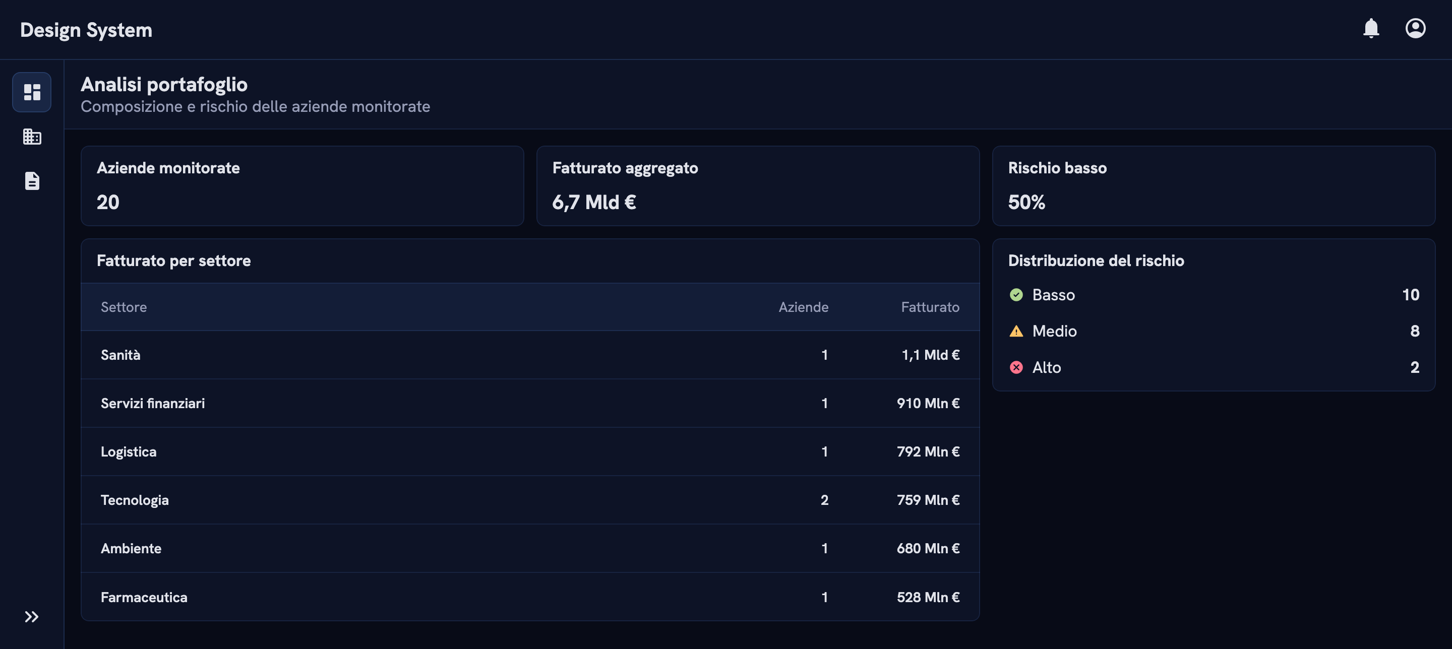
Each product had its own interface. Designers kept re-solving the same layouts and interactions, and users met a different experience in every tool.
Audited existing patterns, defined the token architecture, designed the component library, documented page layouts and set up how changes get proposed and released.
The whole design team, about 10 designers, starts from one library instead of rebuilding or copy-pasting from old projects. The system became the base for the accessibility work and the AI kit.
01 · Context
Cerved builds data-intensive B2B products: company archives, risk assessments, dashboards full of tables and filters. Over time each product had developed its own interface conventions.
The result was duplicated effort for designers, who either rebuilt search, selection and table patterns from scratch or copy-pasted them from other projects, and inconsistency for users, who often work across several of these tools.
02 · Approach
I compared how each product handled recurring tasks (searching, selecting, triggering actions) to decide what belonged in the shared library and which real differences the components had to support.
I defined a token taxonomy that separates what a value means from what it looks like. Components only reference semantic tokens, so a theme is just a different set of values: light, dark and the white-label themes for banking clients run on the exact same components.
Cerved's products are dark by default, with light as a complete alternative. Dark is the harder theme to get right, especially for contrast and elevation, so both themes are checked pair by pair.
color-on-surface-high-emphasis is #263873 in light and #e1e3ea in dark.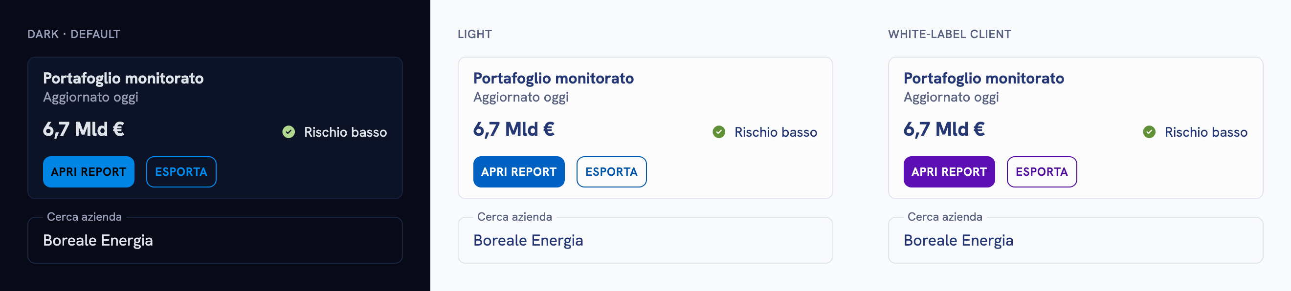
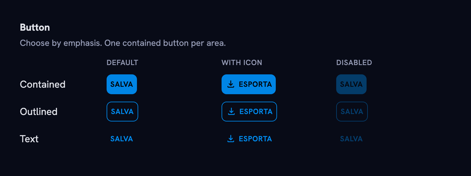
For each component I defined anatomy, variants and states and, just as important, when to use which variant. That guidance is what stops a library from turning into a menu of options.
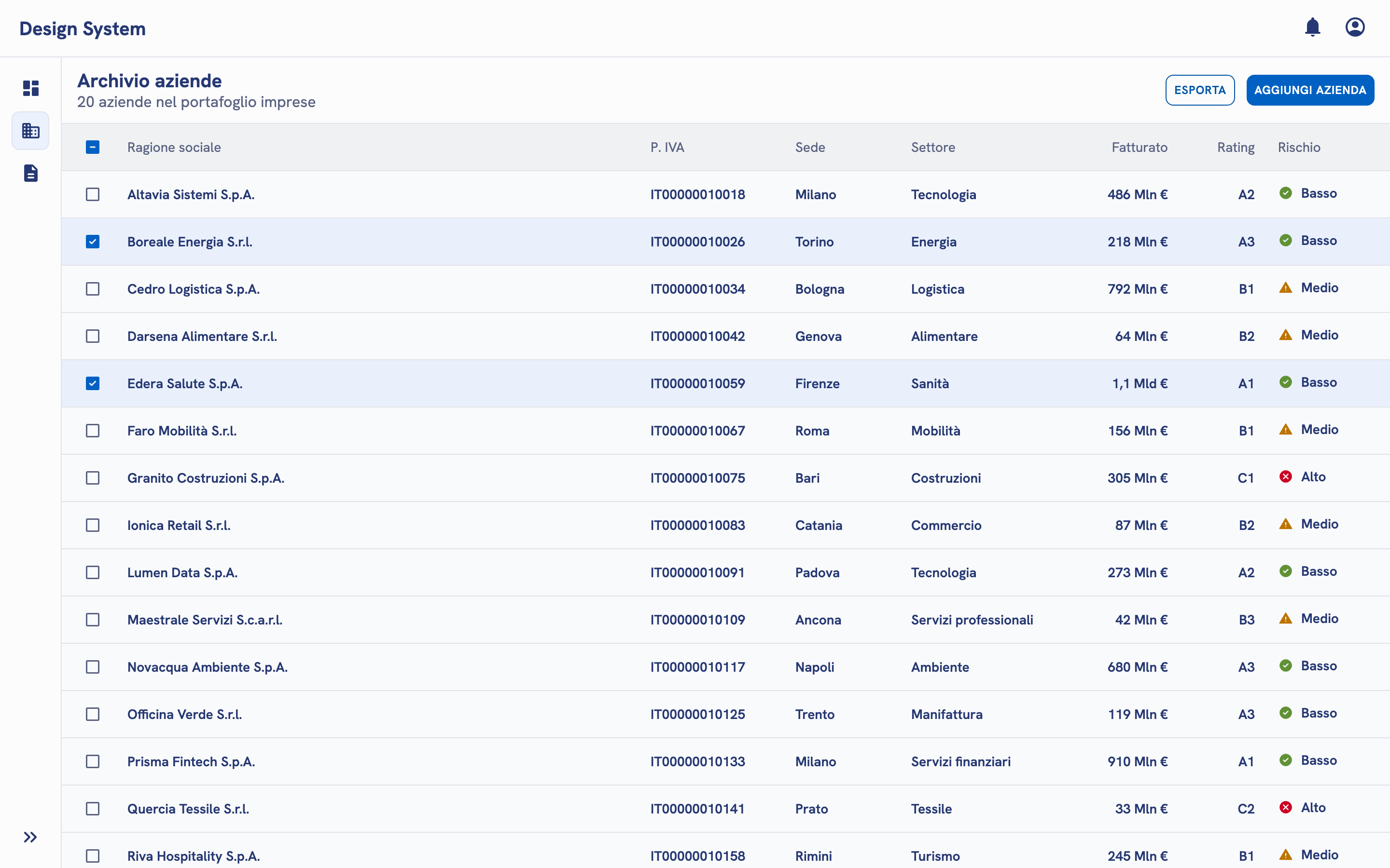
Components alone don't make consistent products. I documented page layouts: where navigation, headers and content go, and how they scroll. In an archive, the table is the workspace. In a dashboard (above), the same table sits inside a card next to summary metrics. On an entity page, cards and data blocks organise everything about one company.
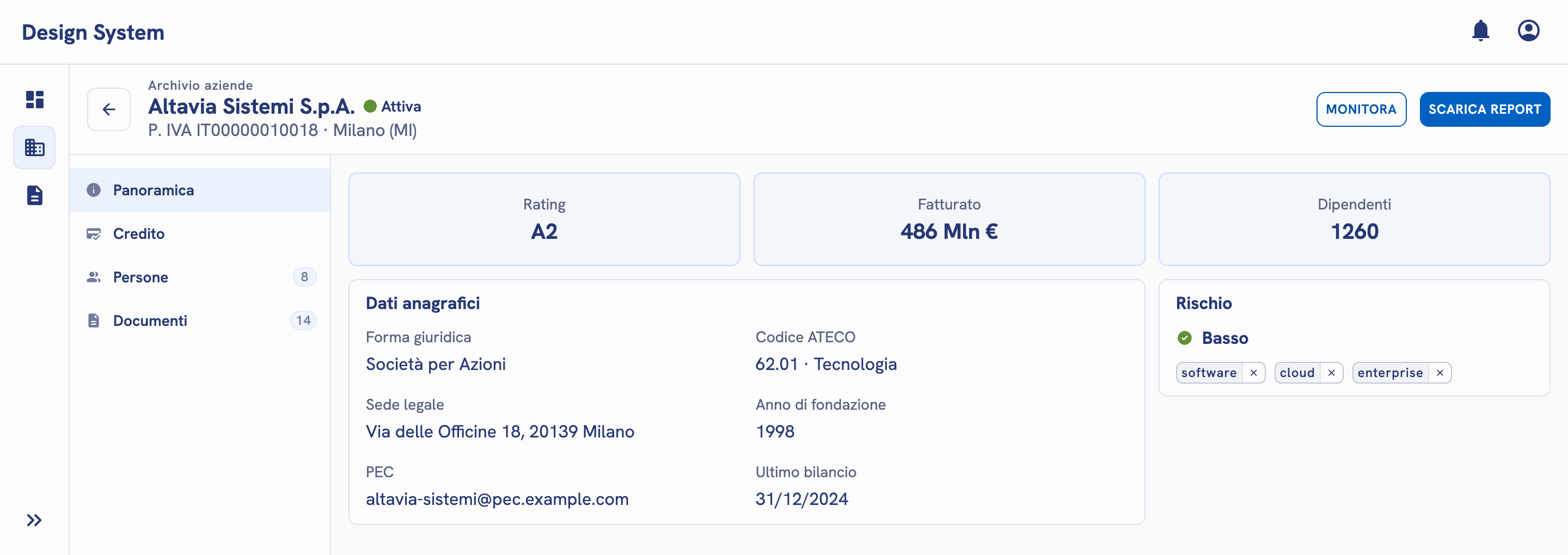
I validated feasibility with IT while building the system, published the Figma library and guidelines, and defined contribution standards for how changes are proposed, reviewed and released.
03 · Key decisions
Client and product themes change token values only, never component structure.
WhyOne set of components to maintain, test and make accessible, no matter how many brands it serves.
I documented page patterns (archive, dashboard, entity detail, wizard) alongside components.
WhyMost inconsistency between products came from how pieces were assembled, not from the pieces themselves.
Every component guide starts with when to use it, not how it looks.
WhyVisual specs tell you how to draw a button. Usage rules tell you which button. That's where products diverge.
04 · Outcome
A design system succeeds on adoption, not on the size of its library. The time spent on documentation and on a clear contribution process paid back more than any single component.
I'd be glad to talk about how this one was built and rolled out.
hello@mauriziocarlini.com