Token pairs, not screens
Contrast was verified on the combinations designers are allowed to use, not on individual pages.
WhyA finite set of pairs can be fully verified. An unbounded set of screens can only be sampled.
Case study · Cerved · EAA readiness
The European Accessibility Act turned accessibility into a legal requirement with a deadline. I translated WCAG into specific work for each team and made sure fixes happened once, in the design system, instead of product by product. Today all Cerved products and websites meet the EAA's WCAG AA criteria.
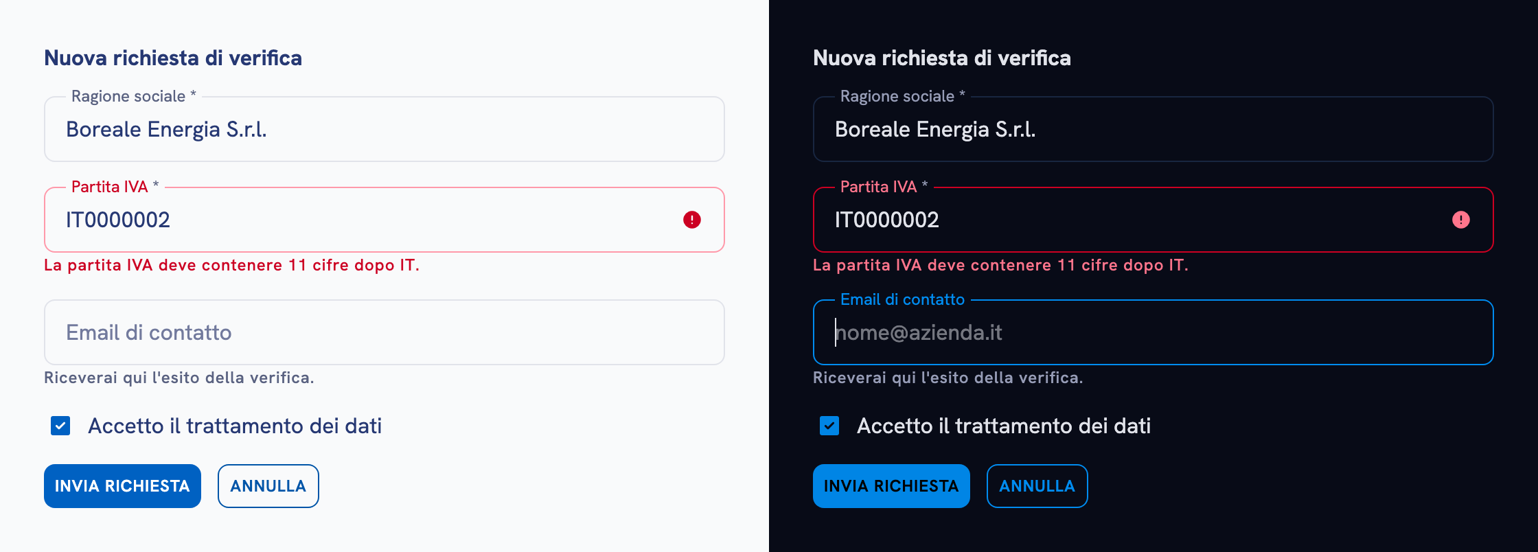
WCAG has dozens of success criteria. Teams didn't know which ones were theirs, and fixing products one by one would never scale.
Studied EAA and WCAG, assigned each criterion to the team that owns it, checked every colour pair in the system, fixed failures in the tokens and locked unsafe pairs in Figma.
All Cerved products and websites meet the EAA's WCAG AA criteria. Each team knows which criteria are its own, and fixes made in the tokens reach every product.
01 · Context
Accessibility had been part of the design system from the start. But the European Accessibility Act raised the bar: it applies to the whole product, not just to components, and it comes with legal obligations.
The challenge wasn't awareness, it was ownership. A criterion like "labels or instructions" touches designers, developers and copywriters at once. Without a clear owner, it falls between the gaps.
02 · Approach
I studied the EAA and the WCAG criteria it points to, to understand what the work needed to cover and which decisions belonged to which discipline.
I split the criteria by responsibility: visual rules to my design team, behaviour and semantics to developers, labels, instructions and text alternatives to the people who write and publish content.
Instead of auditing screens, I checked every colour combination the system allows, in both themes, inside Figma. If a token pair passes, every screen that uses it passes. If it fails, one fix corrects every product.
The check found many failing pairs, mostly on elevated surfaces, the primary colour and low-emphasis text. The palette was already built in HSL, with colours in the same family differing only in lightness. That let me fix each pair by adjusting lightness alone, without changing the brand's hues.
A few combinations didn't make sense for the interface at all. Instead of fixing them, I ruled them out in the guidelines and restricted them directly in Figma's settings, so designers can't pick them.
Roles matter too. The low-emphasis colour is reserved for icons only, where WCAG asks for 3:1 instead of 4.5:1, so it never ends up on text it can't support.
| Token pair | Light | Dark |
|---|---|---|
| High-emphasis text | 10.60:1 | 15.30:1 |
| Medium-emphasis text | 5.74:1 | 7.22:1 |
| Primary text and links | 7.01:1 | 5.61:1 |
| Error text | 8.48:1 | 9.70:1 |
| Label on primary button | 6.02:1 | 5.49:1 |
| Low-emphasis icons 3:1 required | 4.03:1 | 4.66:1 |
03 · Key decisions
Contrast was verified on the combinations designers are allowed to use, not on individual pages.
WhyA finite set of pairs can be fully verified. An unbounded set of screens can only be sampled.
Each criterion went to the team that controls the outcome, rather than to a single "accessibility checklist".
WhyA shared checklist belongs to nobody. A list per discipline fits into each team's existing workflow.
Colour pairs that made no sense were restricted directly in Figma's settings, not only flagged in the documentation.
WhyA rule people can't break works better than a rule they have to remember.
Labels, keyboard interaction, focus and feedback became part of every component's documentation.
WhyRequirements live where people make decisions and, later, where AI agents read them too.
04 · Outcome
Regulation is a powerful moment to change habits. The deadline got attention; turning it into each team's own work is what made it stick.